Top Color Trends for Commercial Buildings This Fall
As summer fades and the air turns crisp, it’s not just wardrobes that change—commercial buildings can benefit from a seasonal style refresh, too. The right paint colors do more than look nice; they influence how customers perceive your business, help you stand out, and even boost employee morale.
This fall, we’re seeing a shift toward rich, grounded tones that feel both professional and inviting:
1. Warm Neutrals – Shades like sandy beige, warm taupe, and creamy almond create a timeless look that complements almost any brand. These colors work beautifully as a base, allowing signage and accent colors to shine.
2. Deep Greens – Inspired by nature, greens such as forest, moss, and olive are making a big comeback. They signal stability, sustainability, and trust—perfect for businesses looking to project a reliable, eco-conscious image.
3. Bold Blues – Navy, cobalt, and midnight blue are strong statement colors without feeling overwhelming. They add a touch of sophistication and pair well with metallic finishes for a modern look.
4. Burnt Reds & Terracottas – These earthy tones are warm, welcoming, and seasonally on point. They can be used as an accent to draw attention to entryways or architectural features.
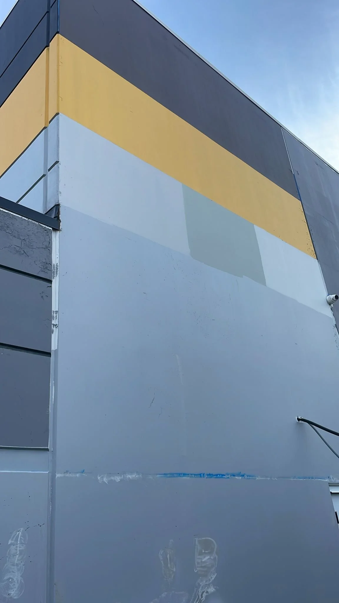
When planning a color update, remember that lighting and surroundings matter. A color that looks vibrant on a sunny summer day may appear muted in the softer light of fall. Always test swatches on your building before committing.
Refreshing your exterior this season not only keeps your property looking its best but also protects it from the harsher months ahead. The right color now can carry your brand beautifully through winter—and have you turning heads well into spring.
Happy painting!
Buhler Painting is dedicated to educating home and business owners with information that will help enhance your painting experience.
If you reside in the Abbotsford, Langley, and Lower Mainland areas, be sure to give us a call.

